Choosing the right resolution for a 2D Platformer
In this post I’ll try to write down the thinking process I made when I chose to develop Kren at a 384×216 sceen resolution.
Please note!
This post is still valid BUT I highly recommend reading the post where I talk about Pixel Decimation and how to avoid it using Surfaces in GameMaker Studio.
You can achieve pretty decent results with ANY RESOLUTION (given you respect the monitor aspect ratio)
Tiles
Everything starts with the tiles. If you make tiles your measurement unit, you’re going to be able to simplify the visualization process. I made this kind of reasoning: how many 16px square tiles do I want displayed vertically?
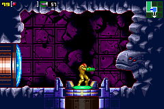
I wanted to be able to show at least 10 tiles. Which then I realized was a pretty low number for a Desktop game. That meant having a vertical resolution of 160px. That was the resolution of Metroid Zero Mission, on a Game Boy Advance. Granted, it looked great even on an emulator, on a Desktop PC… but… did I really want to go with that little number of tiles? Let’s look at how others approached the problem…
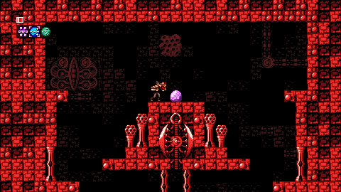
Axiom Verge, a more modern desktop platformer, is displaying almost 17 tiles vertically, at a vertical resolution of 270px. So I had to stop and ponder a little. Was it enough? Was it too much?
Too much indeed. Axiom Verge displays gigantic environments around one of the smallest player character I’ve ever seen. The player’s height to screen height ratio is absurd. But it works, for that game.
I wanted to keep a more claustrophobic feeling. Given I didn’t want to mess with tile size, I had to display less tiles. Simply by reducing the resolution.
Aspect Ratio
Metroid Zero Mission has a resolution of 240×160. It’s a 3:2 aspect ratio and it’s not what most computers use today (or even back in the days). In fact the 16:9 aspect ratio is now almost a universal standard. Or at least you can find it in most of the TV sets, desktops and notebooks you see around.
Back to Axiom Verge. It’s 16:9, which is great. But I already chose not to go with a resolution as high as 480×270 because I want less tiles on the screen.
Don’t get me wrong. If you want to be able to display a great number of 16×16 tiles on the screen, 480×270 is a really great option. I would advise you go with that resolution! It’s 1/16th the pixel area of a Full HD monitor. Which means it scales pretty well without pixel interpolation artifacts (you multiply 480 and 270 by 4 and you get the 1920×1080 Full HD resolution).
Next, I looked at the closest 16:9 resolution available with almost the same vertical resolution as the Game Boy Advance: 288×162.
I made a few tests at this resolution and even though I liked it (a lot), it doesn’t scale well. There’s no easy way to scale the 288×162 resolution to perfectly fit a 1920×1080 monitor. That means problems. Also, even though I liked the effect, it really is a little bit ugly. And maybe a little too much claustrophobic, even for my game; there’s barely enough space to fit 10 tiles, vertically. Given my player’s height is a bit more than 2 tiles, it meant huge player (yes, you can draw a different character), really small “field of view” and ugly pixels.
The 384 x 216 Compromise
I finally found the optimal compromise resolution: 384×216. Multiply that by 5 and you get the Full HD resolution. This should avoid pixel interpolation distortions. It also allows me to display 13.5 tiles vertically. This is not that far from the Game Boy Advance look, but it sits nicely between Metroid Zero Mission and Axiom Verge.
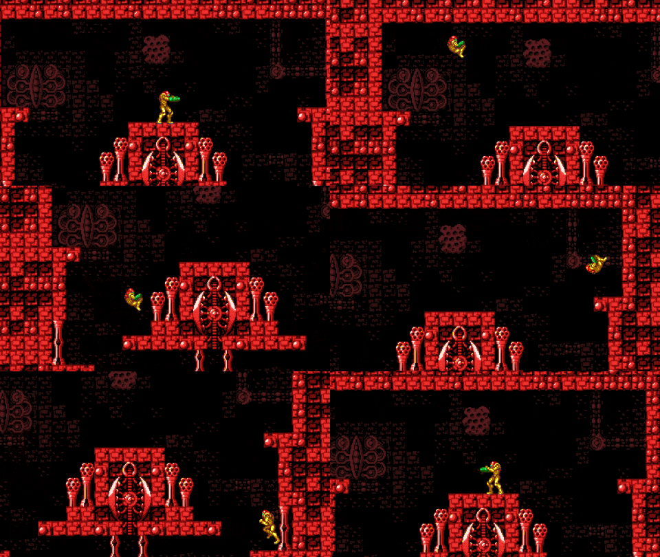
I don’t want the player to feel small, inside gigantic environments. I want the players to feel the environment around them. Leaving him/her with little air. But not as little as in Metroid ZM on the GBA. All with a modern 16:9 look.
I found my own resolution with this process and a bit of testing. It might not be the best approach (in fact I’m sure I might have missed some other considerations) but for now it’s working great. Your mileage may vary so I recommend a lot of testing.
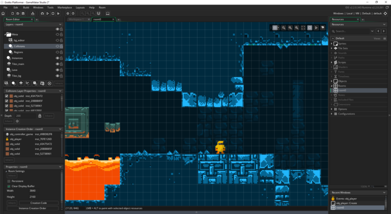
This is a great article. I was just looking into was resolution I should set my game at that is 16 x 16 pixel art. I think I too am going to try 384 x 216. I was going with 384 x 240 but after a while noticed I had some pixel stretching going on when scaled to 16:9 1080P monitor. Then I thought maybe 512 x 288, which scales great but is a little too much screen real estate to fill in with tiles.
384 x 216 seems like the sweet spot but that half a tile extra might drive me nuts! I guess just fill it in with tiles half on and off screen?
The extra 8 pixels issue can be easily managed.
Half tile on top or bottom might be the best solution.
Or maybe you could try using smaller tiles here and there to fill the spaces (I have 16×16 tiles and many 8×8 to give the game a bit of variety).
I use a 8×8 grid size with both 16px and 8px tiles.
Gotcha. Yes that would work. Thanks for the info.